
Explore


Verticals we serve


Music Companies
Bandzoogle, Music Glue alternative.


Opticians
iLens, Mistral, VisionWeb alternative.


Real Estate Agencies
Whise, Sweepbright, Immoweb alternative.


Restaurants & Takeaways
Uber Eats & Takeaway commission alternative.
Services


Brand-Driven Product Strategy
Align product design with your brand's identity and goals.


UX & Design Systems
Build consistent, scalable, and user-friendly interfaces.


Development Support & Execution
Turn designs into real, high-quality digital products.


AI-Powered Workflows & Innovation
Use smart tools to move faster and reduce cost.


Let’s start the design conversation in Figma.
We’ll review structure, components, and UX flows, then suggest what to fix first to make it consistent and scalable.
// WHY YOU NEED FIGMA
Design debt is real. So is handoff hell.
When teams move fast without systems, the result is chaos: duplicated components, messy UX, endless revisions, and frustrated developers.
We fix that by putting structure where it matters - in the product’s foundation.

Figma
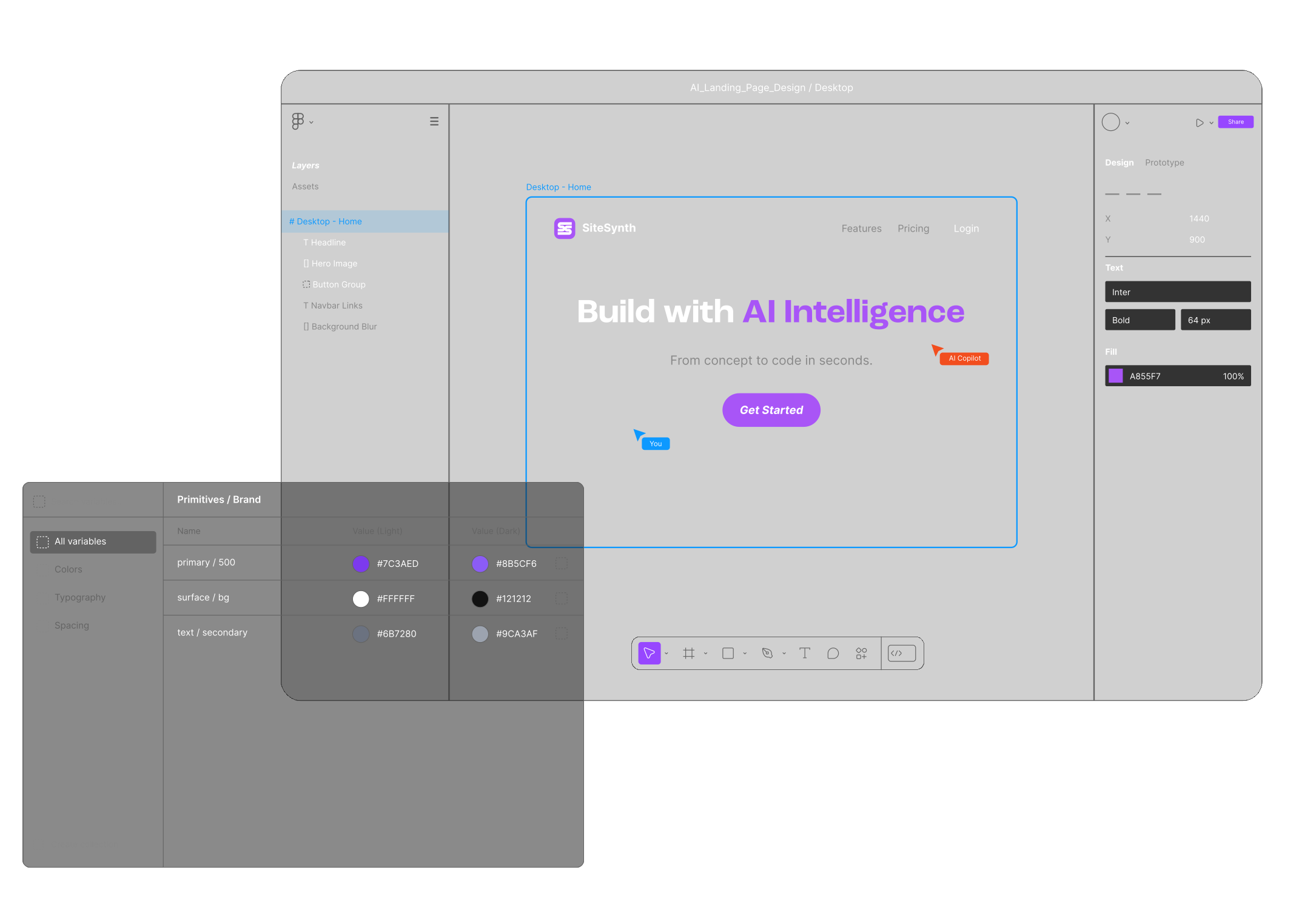
Design Systems That Scale
From tokens to components to documentation - we build reusable, flexible design foundations that support your team’s workflow, not slow it down. Using Figma as the single source of truth, we create shared libraries, usage rules, and naming standards your team can actually use - with optional dev integration via Zeroheight or Storybook.
FigJam
UX Architecture That Makes Sense
From tokens to components to documentation - we build reusable, flexible design foundations that support your team’s workflow, not slow it down. Using Figma as the single source of truth, we create shared libraries, usage rules, and naming standards your team can actually use - with optional dev integration via Zeroheight or Storybook.
Learn more about FigJam
Figma Dev Mode
Built for Real Teams, Not Just Slides
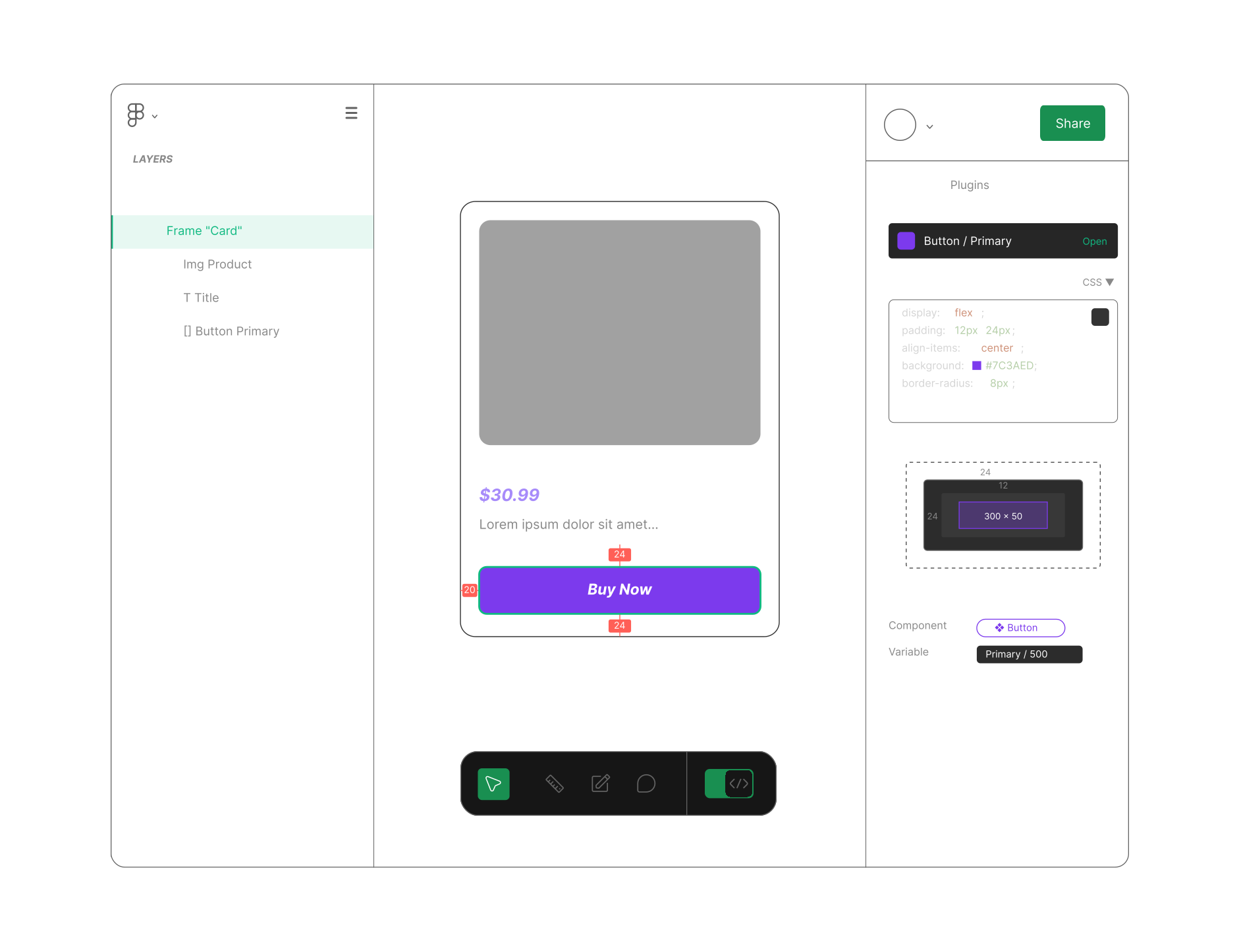
We design with engineers in mind - ensuring everything is structured, inspectable, and ready to build. Using Figma’s Dev Mode, we bridge the gap between design and development with clear tokens, component logic, and handoff details - no extra tools, no ambiguity.
Learn more about Dev Mode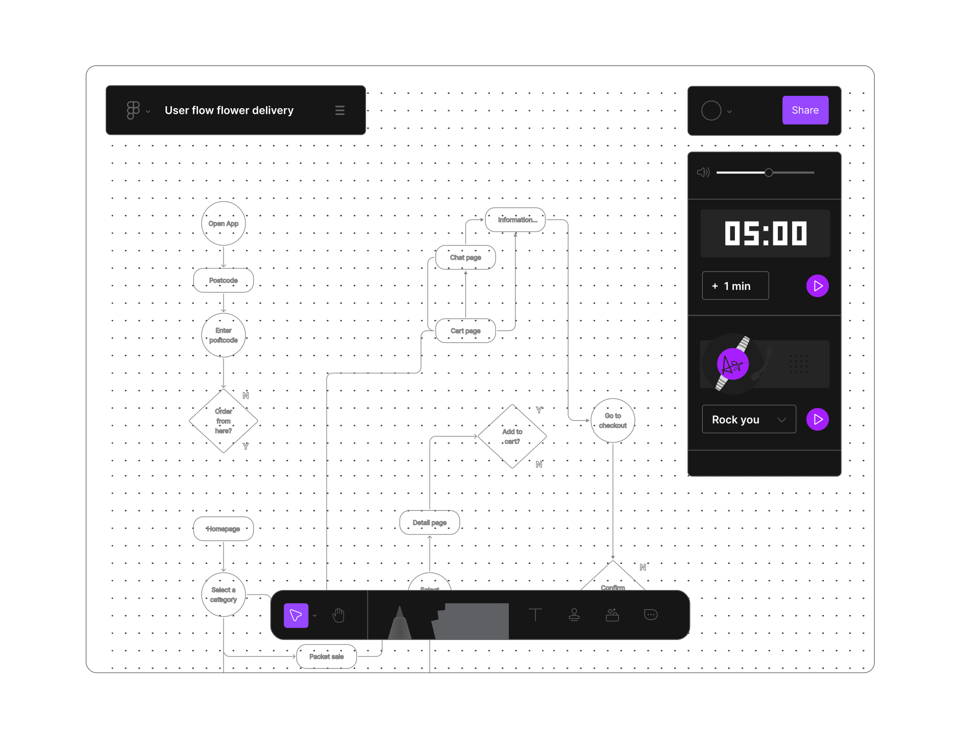
// WHAT YOU GET
Design systems that scale with you.
Tokens, components, and patterns engineered for production — not just Figma.
Figma System
Single source of truth for UI, tokens, and variants.
UX Flows
Journeys, states, and edge cases mapped clearly.
Usage Rules
When to use patterns — with do/don’t examples.
Dev Specs
Specs for spacing, states, and behavior — ready to build.
System Docs
Naming, structure, and usage in Dev Mode or your tool.
Living Docs
Docs that stay updated: checklists, notes, decisions.
FAQ
Design systems — your questions, answered
If more than one person touches your product — or you ship regularly — a design system pays for itself fast. It removes duplicated components, inconsistent UI, and the endless back-and-forth between design and development. For a single static page it’s overkill; for a growing product it’s the foundation.
A Figma file is a starting point, not a system. A real design system adds tokens, reusable components with usage rules, documented states and edge cases, and dev-ready specs — so the file stays consistent as your team and product grow, instead of drifting into chaos.
A focused, production-ready design system usually takes a few weeks, depending on the size of your product and how much existing UI we’re consolidating. We scope it up front so you know exactly what’s included and when.
That’s the whole point. We build with engineers in mind — clear tokens, inspectable components, and Figma Dev Mode handoff (optionally wired to Storybook or Zeroheight). The goal is a system your developers reach for because it’s faster than not using it.
Both are options. Where your current file has a usable foundation, we refactor and structure it; where it’s holding you back, we rebuild the parts that matter. We’ll tell you honestly which path saves you more time.
Yes. We can align design tokens with your front-end — React, Vue, or your framework of choice — so a change in the system maps cleanly to code, reducing handoff friction and visual bugs.
A single source of truth in Figma, mapped UX flows, usage rules with do and don’t examples, dev specs for spacing and behaviour, and living documentation your team maintains — not a one-off file that goes stale.
Ready to make your design system real?
We work with founders, product leads and marketing teams to shape digital products that reflect who you are — and scale with who you are becoming. A 30-minute call, no pitch.